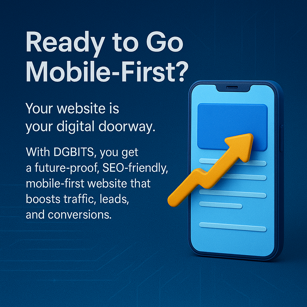
Why Mobile-First Web Design Is Non-Negotiable
Users today switch between devices like ninjas — desktops at work, tablets at home, and mobiles everywhere in between. With over half of global internet traffic now coming from mobile devices, your business cannot afford to ignore mobile users.
At DGBITS Software Pvt. Ltd., Tirupati , we specialize in mobile-first responsive website design services that make your brand shine on every screen. We build fast-loading, SEO-friendly, and conversion-focused websites that keep users engaged and turn visits into sales.
A responsive website solves multiple challenges — from improving user experience to boosting SEO rankings. By adopting a mobile-first design strategy, your website not only looks great on small screens but also scales beautifully on desktops. This approach ensures that your visitors spend more time on your site, take desired actions, and contribute to your business growth.
Core Benefits of Our Website Design Services
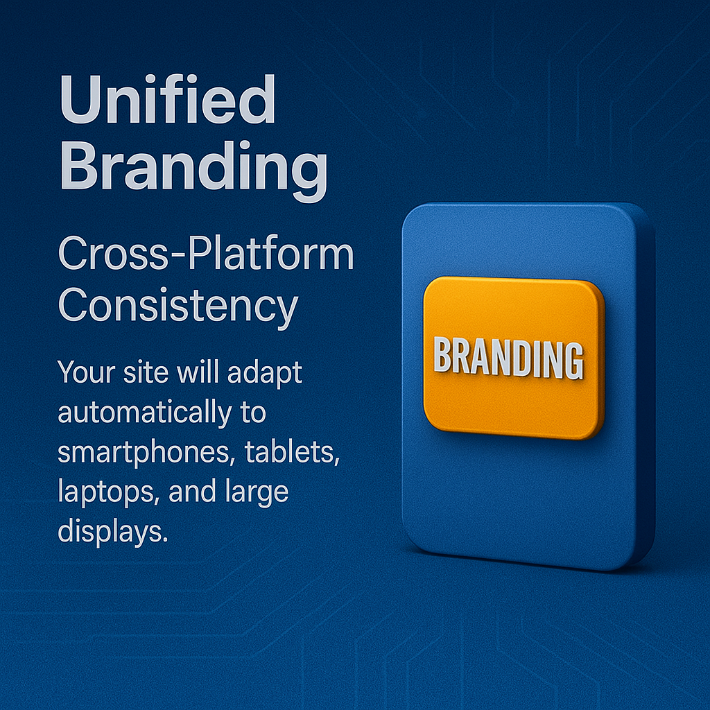
- Multi-Device Compatibility
Our responsive website development ensures flawless adaptation to smartphones, tablets, laptops, and widescreens. No more broken layouts — just a smooth, intuitive browsing experience. - Improved User Experience
A clunky, non-responsive site creates frustration. Our UX/UI experts craft designs with fluid navigation, touch-friendly interfaces, and clear calls-to-action that make users stay longer and convert faster. - Enhanced SEO Rankings
Mobile-friendliness is a key Google ranking factor. A responsive site improves crawlability, reduces bounce rates, and strengthens your SEO — helping you attract more organic traffic. - Faster Loading Times
Users abandon sites that load slowly. Our web performance optimization reduces load times with compressed images, minified code, and responsive frameworks — boosting both engagement and search engine rankings. - Easier Maintenance
A single responsive site eliminates the hassle of maintaining multiple websites for different devices. Update once, apply everywhere. - Cost-Effective Design
Lower maintenance costs, faster deployment, and scalable architecture make our mobile-first design services a high ROI investment. - Consistent Branding
One unified design ensures your brand identity stays intact across all devices and browsers, building credibility and trust. - Simplified Analytics
Responsive websites consolidate analytics into one view, making it easier to track user journeys and optimize marketing campaigns. - Future-Proof Websites
Our responsive websites are future-ready, adapting to new devices, resolutions, and technologies. - Enhanced Social Sharing
Optimized layouts and share buttons make your content easy to distribute across social media, extending your brand’s digital reach.
Our Mobile-First Responsive Web Design Process
- Personalized Solutions – Websites built with Laravel, React, Vue, Tailwind CSS and Bootstrap tailored to your business needs.
- User-Centric Design – We employ A/B testing, heatmaps, and UX strategy to optimize every user journey.
- Performance Engineering – Optimized for speed, SEO, and mobile conversions from the ground up.
- Enterprise-Grade Security – SSL, secure payments, encryption, and regular vulnerability checks.
- Ongoing Support & Maintenance – Continuous updates, monitoring, and improvements post-launch.
Why Choose DGBITS as Your Web Design Partner?
At DGBITS, we build with mobile-first intent, not mobile-last adaptations. With over a decade of experience in Laravel, Django, Node.js, React, Vue, Tailwind, and Bootstrap, we create responsive, high-performance websites that aren’t just resized for mobile — they’re engineered for it.
We go beyond basic responsiveness by integrating:
- AI-powered assistants for real-time support.
- Performance-tuned architectures for speed and scalability.
- SEO-first practices to strengthen visibility.
- Device-specific optimization for real-world users.